Παρουσίαση με Ετικέτες
Όλες οι Ετικέτε... »
css3 (RSS)
This is going to be the seventh post in a series of posts regarding HTML 5. You can find the other posts here , here , here, here , here and here.
In this post I will provide a hands-on example on how to use CSS 3 Media Queries in HTML 5 pages. This is a very important feature since nowadays lots of users view websites through their mobile devices.
Web designers were able to define media-specific style sheets for quite a while, but have been limited to the type of output. The output could only be Screen, Print .The way we used to do things before CSS 3 was to have separate CSS files and the browser decided which style sheet to use.
Please have a look at the snippet below - HTML 4 media queries
<link rel="stylesheet" type="text/css" media="screen" href="styles.css">
<link rel="stylesheet" type="text/css" media="print" href="print-styles.css">
Τhe browser determines which style to use.
With CSS 3 we can have all media queries in one stylesheet. Media queries can determine the resolution of the device, the orientation of the device, the width and height of the device and the width and height of the browser window.We can also include CSS 3 media queries in separate stylesheets.
In order to be absolutely clear this is not (and could not be) a detailed tutorial on HTML 5. There are other great resources for that.Navigate to the excellent interactive tutorials of W3School.
Another excellent resource is HTML 5 Doctor.
Two very nice sites that show you what features and specifications are implemented by various browsers and their versions are http://caniuse.com/ and http://html5test.com/. At this times Chrome seems to support most of HTML 5 specifications.Another excellent way to find out if the browser supports HTML 5 and CSS 3 features is to use the Javascript lightweight library Modernizr.
In this hands-on example I will be using Expression Web 4.0.This application is not a free application. You can use any HTML editor you like.You can use Visual Studio 2012 Express edition. You can download it here.
Before I go on with the actual demo I will use the (http://www.caniuse.com) to see the support for CSS 3 Media Queries from the latest versions of modern browsers.
Please have a look at the picture below. We see that all the latest versions of modern browsers support this feature.
We can see that even IE 9 supports this feature.

Let's move on with the actual demo.
This is going to be a rather simple demo.I create a simple HTML 5 page. The markup follows and it is very easy to use and understand.This is a page with a 2 column layout.
<!DOCTYPE html>
<html lang="en">
<head>
<title>HTML 5, CSS3 and JQuery</title>
<meta http-equiv="Content-Type" content="text/html;charset=utf-8" >
<link rel="stylesheet" type="text/css" href="style.css">
</head>
<body>
<div id="header">
<h1>Learn cutting edge technologies</h1>
<p>HTML 5, JQuery, CSS3</p>
</div>
<div id="main">
<div id="mainnews">
<div>
<h2>HTML 5</h2>
</div>
<div>
<p>
HTML5 is the latest version of HTML and XHTML. The HTML standard defines a single language that can be written in HTML and XML. It attempts to solve issues found in previous iterations of HTML and addresses the needs of Web Applications, an area previously not adequately covered by HTML.
</p>
<div class="quote">
<h4>Do More with Less</h4>
<p>
jQuery is a fast and concise JavaScript Library that simplifies HTML document traversing, event handling, animating, and Ajax interactions for rapid web development.
</p>
</div>
<p>
The HTML5 test(html5test.com) score is an indication of how well your browser supports the upcoming HTML5 standard and related specifications. Even though the specification isn't finalized yet, all major browser manufacturers are making sure their browser is ready for the future. Find out which parts of HTML5 are already supported by your browser today and compare the results with other browsers.
The HTML5 test does not try to test all of the new features offered by HTML5, nor does it try to test the functionality of each feature it does detect. Despite these shortcomings we hope that by quantifying the level of support users and web developers will get an idea of how hard the browser manufacturers work on improving their browsers and the web as a development platform.</p>
</div>
</div>
<div id="CSS">
<div>
<h2>CSS 3 Intro</h2>
</div>
<div>
<p>
Cascading Style Sheets (CSS) is a style sheet language used for describing the presentation semantics (the look and formatting) of a document written in a markup language. Its most common application is to style web pages written in HTML and XHTML, but the language can also be applied to any kind of XML document, including plain XML, SVG and XUL.
</p>
</div>
</div>
<div id="CSSmore">
<div>
<h2>CSS 3 Purpose</h2>
</div>
<div>
<p>
CSS is designed primarily to enable the separation of document content (written in HTML or a similar markup language) from document presentation, including elements such as the layout, colors, and fonts.[1] This separation can improve content accessibility, provide more flexibility and control in the specification of presentation characteristics, enable multiple pages to share formatting, and reduce complexity and repetition in the structural content (such as by allowing for tableless web design).
</p>
</div>
</div>
</div>
<div id="footer">
<p>Feel free to google more about the subject</p>
</div>
</body>
</html>
The CSS code (style.css) follows
body{
line-height: 30px;
width: 1024px;
background-color:#eee;
}
p{
font-size:17px;
font-family:"Comic Sans MS"
}
p,h2,h3,h4{
margin: 0 0 20px 0;
}
#main, #header, #footer{
width: 100%;
margin: 0px auto;
display:block;
}
#header{
text-align: center;
border-bottom: 1px solid #000;
margin-bottom: 30px;
}
#footer{
text-align: center;
border-top: 1px solid #000;
margin-bottom: 30px;
}
.quote{
width: 200px;
margin-left: 10px;
padding: 5px;
float: right;
border: 2px solid #000;
background-color:#F9ACAE;
}
.quote :last-child{
margin-bottom: 0;
}
#main{
column-count:2;
column-gap:20px;
column-rule: 1px solid #000;
-moz-column-count: 2;
-webkit-column-count: 2;
-moz-column-gap: 20px;
-webkit-column-gap: 20px;
-moz-column-rule: 1px solid #000;
-webkit-column-rule: 1px solid #000;
}
Now I view the page in the browser.Now I am going to write a media query and add some more rules in the .css file in order to change the layout of the page when the page is viewed by mobile devices.
@media only screen and (max-width: 480px) {
body{
width: 480px;
}
#main{
-moz-column-count: 1;
-webkit-column-count: 1;
}
}
I am specifying that this media query applies only to screen and a max width of 480 px. If this condition is true, then I add new rules for the body element.
I change the number of columns to one. This rule will not be applied unless the maximum width is 480px or less.
As I decrease the size-width of the browser window I see no change in the column's layout.
Have a look at the picture below.

When I resize the window and the width of the browser so the width is less than 480px, the media query and its respective rules take effect.
We can scroll vertically to view the content which is a more optimised viewing experience for mobile devices.
Have a look at the picture below

Hope it helps!!!!

This is going to be the sixth post in a series of posts regarding HTML 5. You can find the other posts here , here, here , here and here.
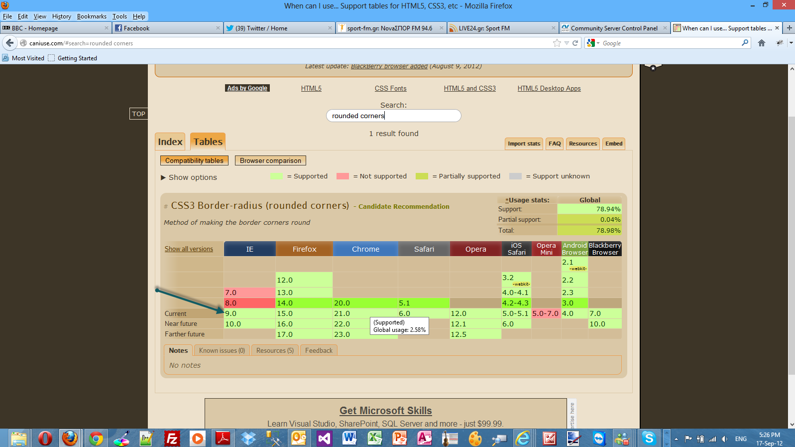
In this post I will provide a hands-on example on how to use rounded corners (rounded corners in CSS3) in your website. I think this is the feature that is most required in the new modern websites.
Most websites look great with their lovely round panels and rounded corner tab style menus.
We could achieve that effect earlier but we should resort to complex CSS rules and images. I will show you how to accomplish this great feature with the power of CSS 3.We will not use Javascript.
Javascript is required for IE 7, IE 8 and the notorious IE 6. The best solution for implementing corners using CSS and Javascript without using images is Nifty corners cube.
There are detailed information how to achieve this in the link I provided. This solution is tested in earlier vesrions of IE (IE 6,IE 7,IE 8) and Opera,Firefox,Safari.
In order to be absolutely clear this is not (and could not be) a detailed tutorial on HTML 5. There are other great resources for that.Navigate to the excellent interactive tutorials of W3School.
Another excellent resource is HTML 5 Doctor.
Two very nice sites that show you what features and specifications are implemented by various browsers and their versions are http://caniuse.com/ and http://html5test.com/. At this times Chrome seems to support most of HTML 5 specifications.Another excellent way to find out if the browser supports HTML 5 and CSS 3 features is to use the Javascript lightweight library Modernizr.
In this hands-on example I will be using Expression Web 4.0.This application is not a free application. You can use any HTML editor you like.You can use Visual Studio 2012 Express edition. You can download it here.
Before I go on with the actual demo I will use the (http://www.caniuse.com) to see the support for web fonts from the latest versions of modern browsers.
Please have a look at the picture below. We see that all the latest versions of modern browsers support this feature.
We can see that even IE 9 supports this feature.
Let's move on with the actual demo.
This is going to be a rather simple demo.I create a simple HTML 5 page. The markup follows and it is very easy to use and understand
<!DOCTYPE html>
<html lang="en">
<head>
<title>HTML 5, CSS3 and JQuery</title>
<meta http-equiv="Content-Type" content="text/html;charset=utf-8" >
<link rel="stylesheet" type="text/css" href="style.css">
</head>
<body>
<div id="header">
<h1>Learn cutting edge technologies</h1>
</div>
<div id="main">
<h2>HTML 5</h2>
<p id="panel1">
HTML5 is the latest version of HTML and XHTML. The HTML standard defines a single language that can be written in HTML and XML. It attempts to solve issues found in previous iterations of HTML and addresses the needs of Web Applications, an area previously not adequately covered by HTML.
</p>
</div>
</body>
</html>
Then I need to write the various CSS rules that style this markup. I will name it style.css
body{
line-height: 38px;
width: 1024px;
background-color:#eee;
text-align:center;
}
#panel1 { margin:auto; text-align:left; background-color:#77cdef;
width:400px; height:250px; padding:15px;
font-size:16px;
font-family:tahoma;
color:#fff;
border-radius: 20px;
}
Have a look below to see what my page looks like in IE 10.

This is possible through the border-radious property. The colored panel has all four corners rounded with the same radius.
We can add a border to the rounded corner panel by adding this property declaration in the #panel1, border:4px #000 solid;
We can have even better visual effects if we specify a radius for each corner.
This is the updated version of the style.css.
body{
line-height: 38px;
width: 1024px;
background-color:#eee;
text-align:center;
}
#panel1 { margin:auto; text-align:left; background-color:#77cdef;border:4px #000 solid;
width:400px; height:250px; padding:15px;
font-size:16px;
font-family:tahoma;
color:#fff;
border-top-left-radius: 20px;
border-top-right-radius: 70px;
border-bottom-right-radius: 20px;
border-bottom-left-radius: 70px;
}
This is how my page looks in Firefox 15.0.1

In this final example I will show you how to style with CSS 3 (rounded corners) a horizontal navigation menu.
This is the new version of the HTML markup
<!DOCTYPE html>
<html lang="en">
<head>
<title>HTML 5, CSS3 and JQuery</title>
<meta http-equiv="Content-Type" content="text/html;charset=utf-8" >
<link rel="stylesheet" type="text/css" href="style.css">
</head>
<body>
<div id="header">
<h1>Learn cutting edge technologies</h1>
</div>
<div id="nav">
<ul>
<li><a class="mymenu" id="activelink" href="http://weblogs.asp.net/controlpanel/blogs/posteditor.aspx?SelectedNavItem=Posts§ionid=1153&postid=8934038#">Main</a></li>
<li><a class="mymenu" href="http://weblogs.asp.net/controlpanel/blogs/posteditor.aspx?SelectedNavItem=Posts§ionid=1153&postid=8934038#">HTML 5</a></li>
<li><a class="mymenu" href="http://weblogs.asp.net/controlpanel/blogs/posteditor.aspx?SelectedNavItem=Posts§ionid=1153&postid=8934038#">CSS 3</a></li>
<li><a class="mymenu" href="http://weblogs.asp.net/controlpanel/blogs/posteditor.aspx?SelectedNavItem=Posts§ionid=1153&postid=8934038#">JQuery</a></li>
</ul>
</div>
<div id="main">
<h2>HTML 5</h2>
<p id="panel1">
HTML5 is the latest version of HTML and XHTML. The HTML standard defines a single language that can be written in HTML and XML. It attempts to solve issues found in previous iterations of HTML and addresses the needs of Web Applications, an area previously not adequately covered by HTML.
</p>
</div>
</body>
</html>
This is the updated version of style.css
body{
line-height: 38px;
width: 1024px;
background-color:#eee;
text-align:center;
}
#panel1 { margin:auto; text-align:left; background-color:#77cdef;border:4px #000 solid;
width:400px; height:250px; padding:15px;
font-size:16px;
font-family:tahoma;
color:#fff;
border-top-left-radius: 20px;
border-top-right-radius: 70px;
border-bottom-right-radius: 20px;
border-bottom-left-radius: 70px;
}
#nav ul {
width:900px;
position:relative;
top:24px;
}
ul li {
text-decoration:none;
display:inline;
}
ul li a.mymenu {
font-family:Tahoma;
color:black;
font-size:14px;
font-weight:bold;
background-color:#77cdef;
color:#fff;
border-top-left-radius:18px; border-top-right-radius:18px; border:1px solid black;
padding:15px; padding-bottom:10px;margin :2px; text-decoration:none; border-bottom:none;
}
.mymenu:hover { background-color:#e3781a; color:black;
}
The CSS rules are the classic rules that are extensively used for styling menus.The border-radius property is still responsible for the rounded corners in the menu.
This is how my page looks in Chrome version 21.

Hope it helps!!!

This is going to be the fifth post in a series of posts regarding HTML 5. You can find the other posts here, here , here and here.
In this post I will provide a hands-on example on how to use real fonts in HTML 5 pages with the use of CSS 3.
Font issues have been appearing in all websites and caused all sorts of problems for web designers.The real problem with fonts for web developers until now was that they were forced to use only a handful of fonts.CSS 3 allows web designers not to use only web-safe fonts.These fonts are in wide use in most user's operating systems.
Some designers (when they wanted to make their site stand out) resorted in various techniques like using images instead of fonts. That solution is not very accessible-friendly and definitely less SEO friendly.
CSS (through CSS3's Fonts module) 3 allows web developers to embed fonts directly on a web page.First we need to define the font and then attach the font to elements.
Obviously we have various formats for fonts. Some are supported by all modern browsers and some are not.The most common formats are, Embedded OpenType (EOT),TrueType(TTF),OpenType(OTF).
I will use the @font-face declaration to define the font used in this page.
Before you download fonts (in any format) make sure you have understood all the licensing issues. Please note that all these real fonts will be downloaded in the client's computer.
A great resource on the web (maybe the best) is http://www.typekit.com/.They have an abundance of web fonts for use. Please note that they sell those fonts.
Another free (best things in life a free, aren't they?) resource is the http://www.google.com/webfonts website. I have visited the website and downloaded the Aladin webfont.
When you download any font you like make sure you read the license first. Aladin webfont is released under the Open Font License (OFL) license.
Before I go on with the actual demo I will use the (http://www.caniuse.com) to see the support for web fonts from the latest versions of modern browsers.
Please have a look at the picture below. We see that all the latest versions of modern browsers support this feature.

In order to be absolutely clear this is not (and could not be) a detailed tutorial on HTML 5. There are other great resources for that.Navigate to the excellent interactive tutorials of W3School.
Another excellent resource is HTML 5 Doctor.
Two very nice sites that show you what features and specifications are implemented by various browsers and their versions are http://caniuse.com/ and http://html5test.com/. At this times Chrome seems to support most of HTML 5 specifications.Another excellent way to find out if the browser supports HTML 5 and CSS 3 features is to use the Javascript lightweight library Modernizr.
In this hands-on example I will be using Expression Web 4.0.This application is not a free application. You can use any HTML editor you like.You can use Visual Studio 2012 Express edition. You can download it here.
I create a simple HTML 5 page. The markup follows and it is very easy to use and understand
<!DOCTYPE html>
<html lang="en">
<head>
<title>HTML 5, CSS3 and JQuery</title>
<meta http-equiv="Content-Type" content="text/html;charset=utf-8" >
<link rel="stylesheet" type="text/css" href="style.css">
</head>
<body>
<div id="header">
<h1>Learn cutting edge technologies</h1>
<p>HTML 5, JQuery, CSS3</p>
</div>
<div id="main">
<h2>HTML 5</h2>
<p>
HTML5 is the latest version of HTML and XHTML. The HTML standard defines a single language that can be written in HTML and XML. It attempts to solve issues found in previous iterations of HTML and addresses the needs of Web Applications, an area previously not adequately covered by HTML.
</p>
</div>
</body>
</html>
Then I create the style.css file.
<style type="text/css">
@font-face
{
font-family:Aladin;
src: url('Aladin-Regular.ttf')
}
h1
{
font-family:Aladin,Georgia,serif;
}
</style>
As you can see we want to style the h1 tag in our HTML 5 markup.I just use the @font-face property,specifying the font-family and the source of the web font.
Then I just use the name in the font-family property to style the h1 tag.
Have a look below to see my page in IE10.

Make sure you open this page in all your browsers installed in your machine. Make sure you have downloaded the latest versions.
Now we can make our site stand out with web fonts and give it a really unique look and feel.
Hope it helps!!!

This is going to be the fourth post in a series of posts regarding HTML 5. You can find the other posts here , here and here.
In this post I will provide a hands-on example with HTML 5 and CSS 3 on how to create a page with multiple columns and proper layout.
I will show you how to use CSS 3 to create columns much easier than relying on DIV elements and the float CSS rule.
I will also show you how to use browser-specific prefix rules (-ms for Internet Explorer and -moz for Firefox ) for browsers that do not fully support CSS 3.
In order to be absolutely clear this is not (and could not be) a detailed tutorial on HTML 5. There are other great resources for that.Navigate to the excellent interactive tutorials of W3School.
Another excellent resource is HTML 5 Doctor.
Two very nice sites that show you what features and specifications are implemented by various browsers and their versions are http://caniuse.com/ and http://html5test.com/. At this times Chrome seems to support most of HTML 5 specifications.Another excellent way to find out if the browser supports HTML 5 and CSS 3 features is to use the Javascript lightweight library Modernizr.
In this hands-on example I will be using Expression Web 4.0.This application is not a free application. You can use any HTML editor you like.You can use Visual Studio 2012 Express edition. You can download it here.
I will create a simple page with information about HTML 5, CSS 3 and JQuery.
This is the full HTML 5 code.
<!DOCTYPE html>
<html lang="en">
<head>
<title>HTML 5, CSS3 and JQuery</title>
<meta http-equiv="Content-Type" content="text/html;charset=utf-8" >
<link rel="stylesheet" type="text/css" href="style.css">
</head>
<body>
<div id="header">
<h1>Learn cutting edge technologies</h1>
<p>HTML 5, JQuery, CSS3</p>
</div>
<div id="main">
<div id="mainnews">
<div>
<h2>HTML 5</h2>
</div>
<div>
<p>
HTML5 is the latest version of HTML and XHTML. The HTML standard defines a single language that can be written in HTML and XML. It attempts to solve issues found in previous iterations of HTML and addresses the needs of Web Applications, an area previously not adequately covered by HTML.
</p>
<div class="quote">
<h4>Do More with Less</h4>
<p>
jQuery is a fast and concise JavaScript Library that simplifies HTML document traversing, event handling, animating, and Ajax interactions for rapid web development.
</p>
</div>
<p>
The HTML5 test(html5test.com) score is an indication of how well your browser supports the upcoming HTML5 standard and related specifications. Even though the specification isn't finalized yet, all major browser manufacturers are making sure their browser is ready for the future. Find out which parts of HTML5 are already supported by your browser today and compare the results with other browsers.
The HTML5 test does not try to test all of the new features offered by HTML5, nor does it try to test the functionality of each feature it does detect. Despite these shortcomings we hope that by quantifying the level of support users and web developers will get an idea of how hard the browser manufacturers work on improving their browsers and the web as a development platform.</p>
</div>
</div>
<div id="CSS">
<div>
<h2>CSS 3 Intro</h2>
</div>
<div>
<p>
Cascading Style Sheets (CSS) is a style sheet language used for describing the presentation semantics (the look and formatting) of a document written in a markup language. Its most common application is to style web pages written in HTML and XHTML, but the language can also be applied to any kind of XML document, including plain XML, SVG and XUL.
</p>
</div>
</div>
<div id="CSSmore">
<div>
<h2>CSS 3 Purpose</h2>
</div>
<div>
<p>
CSS is designed primarily to enable the separation of document content (written in HTML or a similar markup language) from document presentation, including elements such as the layout, colors, and fonts.[1] This separation can improve content accessibility, provide more flexibility and control in the specification of presentation characteristics, enable multiple pages to share formatting, and reduce complexity and repetition in the structural content (such as by allowing for tableless web design).
</p>
</div>
</div>
</div>
<div id="footer">
<p>Feel free to google more about the subject</p>
</div>
</body>
</html>
The markup is very easy to follow. I have used some HTML 5 tags and the relevant HTML 5 doctype.
The CSS code (style.css) follows
body{
line-height: 30px;
width: 1024px;
background-color:#eee;
}
p{
font-size:17px;
font-family:"Comic Sans MS"
}
p,h2,h3,h4{
margin: 0 0 20px 0;
}
#main, #header, #footer{
width: 100%;
margin: 0px auto;
display:block;
}
#header{
text-align: center;
border-bottom: 1px solid #000;
margin-bottom: 30px;
}
#footer{
text-align: center;
border-top: 1px solid #000;
margin-bottom: 30px;
}
.quote{
width: 200px;
margin-left: 10px;
padding: 5px;
float: right;
border: 2px solid #000;
background-color:#F9ACAE;
}
.quote :last-child{
margin-bottom: 0;
}
#main{
column-count:2;
column-gap:20px;
column-rule: 1px solid #000;
-moz-column-count: 2;
-webkit-column-count: 2;
-moz-column-gap: 20px;
-webkit-column-gap: 20px;
-moz-column-rule: 1px solid #000;
-webkit-column-rule: 1px solid #000;
}
All the rules in the css code are pretty simple. The layout is achieved with that CSS rule
#main{
column-count:2;
column-gap:20px;
column-rule: 1px solid #000;
-moz-column-count: 2;
-webkit-column-count: 2;
-moz-column-gap: 20px;
-webkit-column-gap: 20px;
-moz-column-rule: 1px solid #000;
-webkit-column-rule: 1px solid #000;
Do note the column-count,column-gap and column-rule properties. These properties make the two column layout possible.
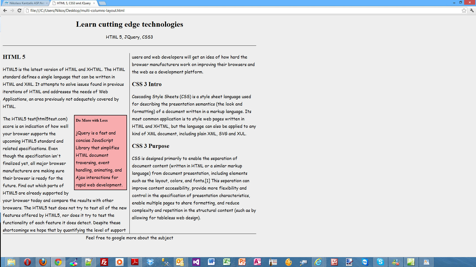
Please have a look at the picture below to see why I used prefixes for Chrome (webkit) and Firefox(moz).It clearly indicates that the CSS 3 column layout are not supported from Firefox and Chrome.

Finally I test my simple HTML 5 page using the latest versions of Firefox,Internet Explorer and Chrome.
In my machine I have installed Firefox 15.0.1.Have a look at the picture below to see how the page looks

I have installed Google Chrome 21.0 in my machine.Have a look at the picture below to see how the page looks
Have a look at the picture below to see how my page looks in IE 10.
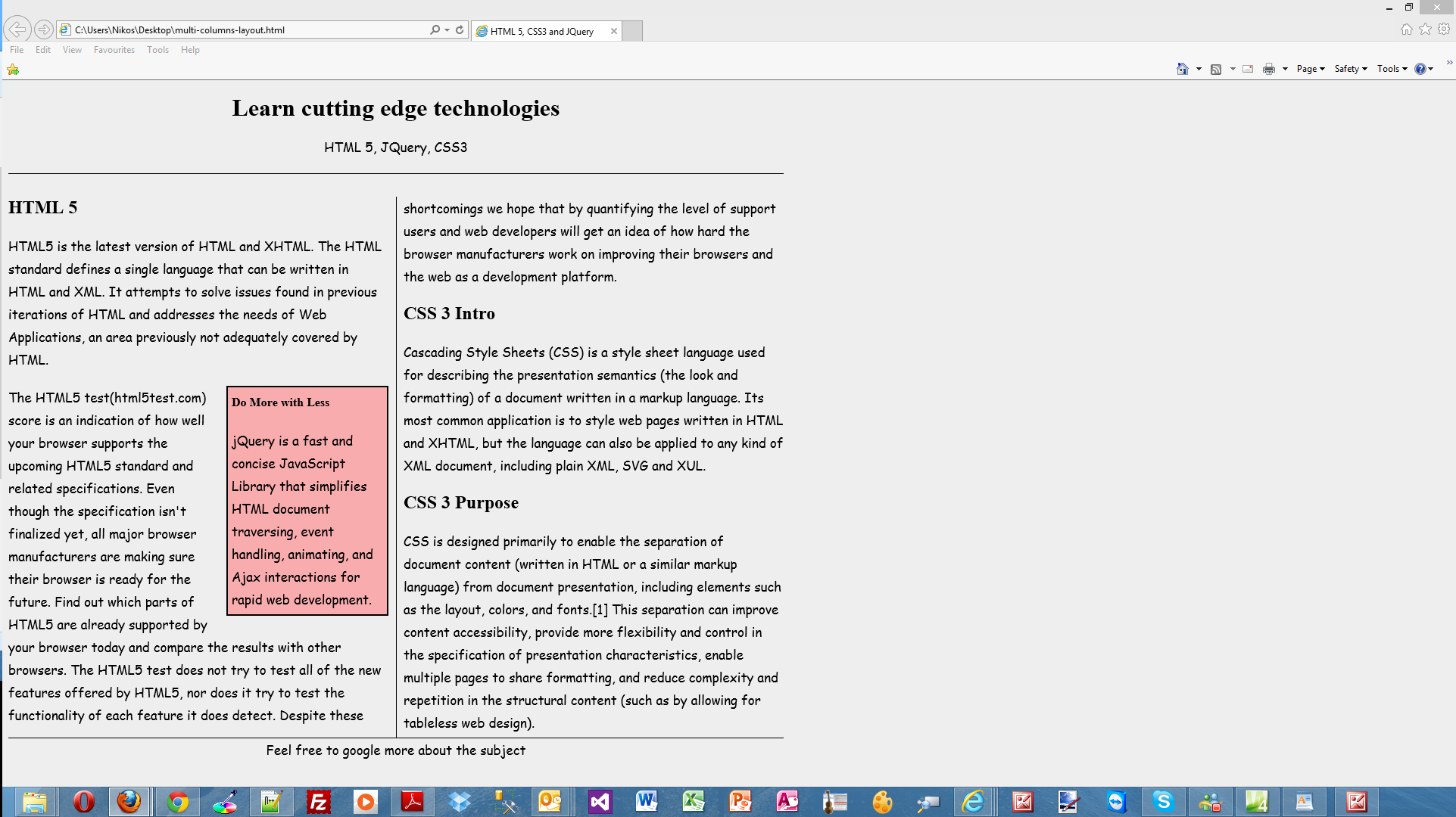
My page looks the same in all browsers.
Hope it helps!!!

I am going to start a new series of posts that focus on HTML 5. HTML 5 is something I wanted to learn and finally I have covered enough ground to feel confident. HTML 5 gives us things like Semantic tags, the possibility to add video and audio in our...(
read more)
